A web app that works as a read-only user interface for online spreadsheets.
The app accesses the sheet through the APIs, interprets each row as an item of a list, and finally showcases it with a user-friendly interface.
You can have a taste of what we are building by visiting the Relist generator page and inserting the URL of this Google spreadsheet.
Other resources you can visit:
– The Github repository.
– The Project Board with ongoing tasks.
*Please be aware that everything you see is work in progress, it might change and evolve fast.
The Challenges.
Building a product from scratch presents several challenges at a product level: from the ideation itself, to the discovery and the delivery of the features.
Relist’s UI design needs to be scalable: it must be designed in a way that facilitates the creation of different themes and must be based on UI components.
Given the scarce resources (a team of 2, part time) the scope of the backlog needs to be contained. Prioritization is fundamental.
The project.
This is a personal open source project, we are currently a team of two: me and a software engineer.
I’m taking care of the whole product design and product discovery. I’m also defining the roadmap and managing the backlog.
The product idea is based on the fact that spreadsheets are largely used to keep track of any kind of personal things. And while everyone organizes them differently, we can abstract them as a series of items with few attached properties.
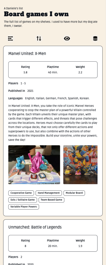
As example, in these screenshots I’m considering the case of a spreadsheet containing a board game inventory. Each of the games comes with single properties (e.g. the rating), and arrays (e.g. gallery of images).
The app allows all of this information to be rendered with a design that is easy to read and navigate. Each game is listed vertically as a card that the user can expand, sort, search, filter, and bookmark.
The application doesn’t require any admin interface. It can fetch the data from the spreadsheet and visualize the content just by inserting the spreadsheet link in an input field. And after that, the list can be shared with everyone. No login is required, neither for the user creating the list nor for the ones visiting it.


Manipulating the list.
The users can access the sorting settings from the main menu and choose a criterion from all the available properties.
The menu also offers the option to display the tags (in orange) in the main view. This is up to the user because in case of a great number of tags the main view could become too crowded of information and reduce the readability.

Expanding the cards.
By tapping on the eye icon from the main menu, the users can enter the “details” mode and see all the properties attached to the items, images included.

Filtering the list.
The filters, fundamental to exploring the list, are accessible with the first icon from the main menu.
The filters panel allows filtering through all the numerical properties of the items.
On the other hand, the search field in the header allows searching the tags and other text-based properties.

Bookmarking
The users can add items to their favourites ⭐️ thanks to the local storage and without having to create an account.
They can also see which items are favourites by the list owner by looking for the 👑 icon on the card, just above the images.

Theming
The UI was designed with the creation of themes in mind. Indeed, most of the secondary themes were created by using a simple CSS transformation and with a single line of CSS we were able to translate the whole color palettes of the app.
While this solution doesn’t allow a granular control over the generated color codes, it allowed us to provide different themes even at this very early stage of the product. Furthermore, it ensures that all the color contrast, and thus the readability, is kept unaltered.

The latest version of Relist app displayed in different themes.